CSS 연습 - button 01
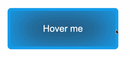
CSS 연습을 하기 위해, uiverse라는 사이트의 디자인들을 적어도 하루에 하나씩 구현해보려고 한다. 오늘 구현해보려고 한 것은 바로 이것이다. (https://uiverse.io/Navarog21/loud-bird-67)

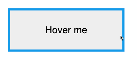
이미지와 같이 마우스를 올리기 전에는 좌우에만 파란색 border가 있고 마우스를 올리면 border가 모든 방향으로 생기고 버튼의 배경색이 변한다. 처음 이 버튼을 보고 border는 이렇게 설정하면 될 것이라 생각했다.
import styled from "styled-components";

const Container = styled.div`
  width: 80%;
  height: 80vh;
  border: 2px solid black;
  border-radius: 20px;
  display: flex;
  justify-content: center;
  align-items: center;
`;

const MyButton = styled.button`
  width: 160px;
  height: 60px;
  border: 3px solid #139cea;
  border-top: none;
  border-bottom: none;
  transition: all 1s linear;

  &:hover {
    border: 3px solid #139cea;
  }
`;

const SampleButton = styled.button``;

export default function Button01() {
  return (
    <>
      <Container>
        <MyButton>Hover me</MyButton>
      </Container>
      <Container>
        <SampleButton>Hover me</SampleButton>
      </Container>
    </>
  );
}
하지만 이럴 경우, 위아래의 border가 각자의 자리에서 위아래로 서서히 커졌다. 하지만 예시의 버튼은 좌우의 border가 점점 길어져서 모든 border가 꽉차는 모양이었다. 그렇기에 이 버튼에는 border가 적용되지 않았을 것이라 생각했었다. 그래서 버튼의 box-shadow를 border처럼 보이게 하면 될 것이라 생각했다.
box-shadow: 10px 10px 10px blue;
// box-shadow: 좌우위치 위아래위치 얼마나번질지 색
const MyButton = styled.button`
width: 160px;
height: 60px;
box-shadow: 4px 0 0 #139cea inset, -4px 0 0 #139cea inset;
transition: all 1s linear;
&:hover {
box-shadow: 4px 0 0 #139cea inset, -4px 0 0 #139cea inset,
0 4px 0 #139cea inset, 0 -4px 0 #139cea inset, 4px 0 0 #139cea inset,
-4px 0 0 #139cea inset;
}
`;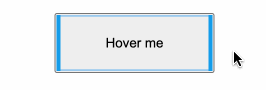
box-shadow에 inset을 적용해 button의 안에 box-shadow가 보이게 했다. hover되기 전에는 좌우에만, hover되었을 때는 모든 방향에 box-shadow가 보이게 했다. 이렇게 했더니 위의 이미지와 같이 움직였다. 하지만 아무리 코드를 고쳐보아도 border가 움직이는 방향을 바꿀 수 없었기에 border는 여기서 끝내고 hover되었을 때의 버튼의 색을 수정하기로 하였다. 배경색은 버튼 중앙으로 들어갈수록 연해지는 것으로 보아 box-shadow라 생각하였다. 마찬가지로 box-shadow를 inset을 통해 버튼 안쪽 색을 변경해줄 수 있을 것이라 생각했다.
const MyButton = styled.button`
  width: 160px;
  height: 60px;
  background-color: #212121;
  color: white;
  border-radius: 5px;
  border: none;
  box-shadow: 4px 0 0 #139cea inset, -4px 0 0 #139cea inset;
  transition: all 1s linear;

  &:hover {
    box-shadow: 4px 0 0 #139cea inset, -4px 0 0 #139cea inset,
      0 4px 0 #139cea inset, 0 -4px 0 #139cea inset, 4px 0 0 #139cea inset,
      -4px 0 0 #139cea inset, 10px 10px 100px #139cea inset,
      -10px -10px 100px #139cea inset;
  }
`;
애니메이션의 시간, box-shadow의 색 등 세세한 부분은 다르지만 대략적인 흉내는 낼 수 있었다고 생각했다. 하지만 border는 여전히 해결할 수 없었다. 다음은 원본 코드를 styled-components로 적용한 것이다.
const SampleButton = styled.button`
  width: 10em;
  height: 3.5em;
  background-color: transparent;
  color: white;
  border: 3px ridge #149cea;
  position: relative;
  outline: none;
  transition: 1s;
  border-radius: 0.3em;
  font-size: 16px;
  font-weight: bold;

  &::after {
    content: "";
    width: 95%;
    height: 40%;
    position: absolute;
    top: -10px;
    left: 3%;
    background-color: #212121;
    transition: 0.5s;
    transform-origin: center;
  }

  &::before {
    content: "";
    width: 95%;
    height: 40%;
    transform-origin: center;
    position: absolute;
    top: 80%;
    left: 3%;
    background-color: #212121;
    transition: 0.5s;
  }

  &:hover::before,
  &:hover::after {
    transform: scale(0);
  }

  &:hover {
    box-shadow: inset 0px 0px 25px #1479ea;
  }
`;
border가 변화하는 방향을 before와 after를 이용해 구현하였던 것이다. 만약 hover된다면 before와 after의 scale을 0으로 만들어버리는데, transform-origin이 center이기에 가운데로 서서히 줄어들게 된다. 그리고 점점 줄어들면서 가려져있던 border가 보이게 되는 것이었다. before와 after에 대해 알고는 있었지만 스스로 써본 적이 거의 없었기에 생각을 하지 못했었다. 이 기회를 통해 before와 after를 애니메이션에도 이용할 수 있다는 것을 깨달았다.
- uiverse